Thursday, 30 April 2015

Sample fonts that reflect and represent the house music genre

EF FUTURA EXTRA BOLD

Is a possible option that I could use as it is clear bold and loud that captures the attention of the audience quickly. The font is flat and sharp symbolising the intentisity of the beat and the change thrrought the song.


Many house music uses strange out the world pop art style fonts for their digipak. In the case if the chemical brothers one, It gives the cover art 1960's-style and feel. The cover was designed by Tappin Gofton. The typeface used in their logo is derived from Sho typeface designed by Karlgeorg Hoefer.


I want to create something inbetween the different fonts used in both albums that linkin park and the chemical brothers have used on there album covers.

Digipak planning

My plan for my Digipak is to create something urban however colourful as well. As the genre of my music video is house music which is usually associated with urban areas. This is because house music is mainly played in clubs, most clubs are based in urban areas. Secondly the reason that I would like my digipak to be full of colour as well is that house music is very diverse and one way to show diversity is through the use of a large spectrum of different colours. Secondly the beat of my music changes through my song therefore the beat of my song is unpredictable from going to sharp beat to a more flat beat. therefore I would like to symbolise this through my Digipak as my song is something unique. I want to illustrate this on my digipak by having small shapes on my digipak that are different shapes. Some that are of a sharp shapes such as triangles to symbolise a sharp beat that my song initials. Flats shapes such as squares and rectangles to represent the flat beat my song entails as well.

Editing process with with a detailed account of what i did with my footage and why i did it

Here is a image of iMovie which i used as a tool to edit my footage. 
Here is a picture of all the possible editing techniques. I am using as many tech niches as possible for editing as i realize this will make my music video interesting. As it would help attract the audience which changing pictures. I also to fit in with the codes and conventions of a house music video, with quick and variety of editing shots. 
Here is a picture of the watch is supposed to act as symbolism as it is supposed to relate to time not being able to stop 
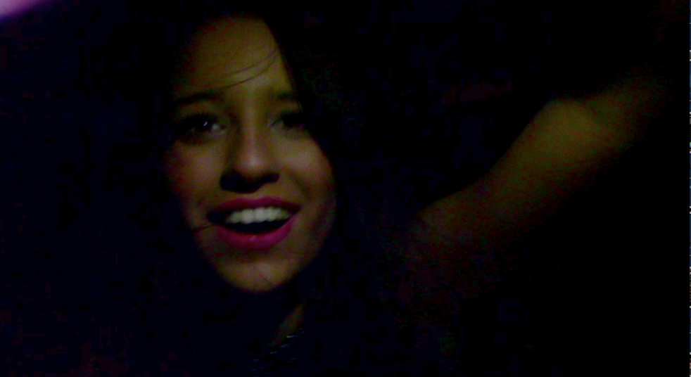
Here is a picture of one of the main protagonists but acts as a mysterious girl as the main protagonist tries to recall the previous night but not in chronological order. I also used edditing to display strobe lighting going off in the back ground using the cutaway effect which merges to shots together. Creating a shot that looks like a club fitting in with the codes and conventions of house music videos.  

Here is a picture of downloaded music save to iTunes that i could implement into footage.
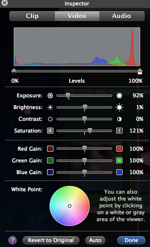
Here is a picture of the different treatment I am applying to each shot which for example will change the contrast and brightness. 


Here is a screenshot of the transition icon on iMovie to represent the switch from modern day to the main protagonist trying to remember what happened on the previous evening/night.

Here is a screenshot of the different video effects that i can use on shots. I decided to change video effects when there was a minor change in the beat of my song.


Here is a screenshot of the editing process on iMovie with different shots of segments of my music video, as one can see the shot changes are timed perfectly with each change in the beat of the music as you can view the spike changes perfectly linked up with the shot frames. 

Here is a screenshot of ken burns was useful as it mean i am bale to crop certain shots and add movement to static shots as well making more music video more interesting for the viewer.


Wednesday, 8 April 2015

Different fonts

I had a look at a rang of possible fonts that I could use for my digipak and my magazine advert. However I chose to use a "CARTOON" FONT on my digipak, I chose this font as it stood out, which was important on a background that was very colourful, secondly it does follow the codes and conventions of house music as it is bold and clear. However for my magazine advert I decided to put Italic effect on "CAARTOON" FONT. As I wanted it slightly different to my digipak, so that it could be distinguishable between the two. 


Saturday, 4 April 2015

Final Cut- With Explanation

Here is my final cut for my music video, I closely followed Goodwins theory of music videos, Dyer star theory and the codes and conventions of house music however I did make sure that I slight deviated fro the codes and conventions of house music. For Goodwis theory I made sure apart from other things that there was a strong relationship between the lyrics and the visuals. For example "I can't stop" I made sure to link it with shots from a first persons shot of going down hill skiing to represent a sense of out of control as well as not being able to stop. For Dyer star theory I made sure that the main protagonist in my music videos were wearing clothes that linked to the hegemony of the house genre. Therefore this should theoretically boost album sales, as the audience and fans can relate to my artist. I made sure that it follows the codes and conventions of house music since the shots and effects are edited to the beat of the music. I have gone gaist the codes and conventions of house music, by showing some of the artists face, however artist such as David Guetta does this as he has made a cross over from house artist to almost pop artist.

Treatment- Give detailed treatment for your video- explain ideas link to target

What I am trying to create is something that does follow Goodwin's codes and conventions of music videos, however my music video will also still link to the target audience. Who would be 18-24 year olds as the primary audience. I want to create a music video that is edited to the beat of the music, with fast and exciting changes in shots with many effects included with them. I also want to create a strong relationship between lyrics and visuals, e.g "I can't stop" with displaying something that is out of control I have considered shots of skiing using a go pro camera, which displays a change in camera type, as well as camera angle.  I also will follow the codes and conventions of typical house music scenes such as clubs. Usually record labels may want close up on the artist face I will supply these shots to a certain extent with my music video however, I still have to tie in with the codes and conventions of house music shots on there artist. They tend not to show the face of there artist as house artists claim to care more about the music instead of the fame. However I do realise that some of the artist face needs to be shown to create a strong brand identity. Therefore I have found a compromise of wanting to show some of the artists face but not revealing all of it. Therefore my artist flux pavilion should still be okay.