Wednesday, 1 April 2015

Two Artist of the SAME GENRE AND STYLE as my chosen artist

Since my song genre is house I therefore reaserched through the use ofggole images different house songs. One I looked in to was Deadmau5 which is actually an artist that I have heard of but I hadn't really looked into them therefore since I like a challenge I decided to look into them. I particularly liked there front cover for the album named 4x4=12.  


This is because the front cover is  simple but effective. The mouse logo has been used which is there logo which Deadmau5 are recognised for,  In addition they have made the outline of the mouse in a neon green colour to give it the effect that its been lit up, this luminescent colour links with the house music genre as it recreates the colours used on club lighting The image of the mouse is placed in the centre of the album making it the main focus of the cover.  I hope to create this effect by having the main focus of my album cover at the centre of my album cover. The artist names and album name is located at the top of the cover so your eye is drawn straight to it naturally, moreover these names have been placed in the same neon green this means continuity is kept. which helps create a strong brand.


 Here is a magazine representing Deadmau5 note that there is brand being created as the artist does't show his, secondly the use of having the mouse head pice on, which is what deadmau5 icon and what they are recognized worldwide for. This is what deadmau5 is recognized for therefore for the sake of continuity it is important that for most of deadmau5. That is why both on his album cover and the magazine the mouse icon is displayed. 


Here is the front cover od David Guetta One love album, I have already researched David Guetta in my research and planning of codes and conventions of different house artists. This digipak represents David Guetta well as a dance artist because on the front cover it shows a mid shot of him wearing a white t-shirt and sunglasses. This picture links in with dance conventions well as he is wearing big sunglasses which connote fame and high status, also a lot of dance artist wear sunglasses indoors in their music videos such as Calvin Harris. His t-shirt which is casual clothing which links in with dance genre of being casual, this links to what costumes I want to include in my music video, of casual clothing for any guys. It is effective that he is black and white as it makes him stand out, it is similar to deadmau5 in the sense that the artist doesn't want his face fully exposed therefore he has sunglasses on to cover some of his face. The reason that he doesn't want all his face shown is that he cares more about the music instead of the fame. I may use this in my album cover by still including sunglasses as well. Secondly I have taken note as Guetta is in Black and white I may want to incorporate this in my magazine advert and/or digipak as I want to make sure that my artist does stand out as he is a new artist but I still want to follow the codes and conventions of house music. David Guetta creates a strong brand image through his sunglasses as he is associated with them, therefore recognisable. Furthermore he has another distinct feature, his long hair which also symbolises the house music genre of being relaxed.


Here is a magazine with a picture of David Guetta, as you can see he has his sunglasses on, still the same that he has on his album cover. There'r he is strengthening his brand image through the use of continuity. He also has casual lose clothing on, which is the typical dress wear for house music fans, this relates to dyer star theory as the artist links to his fans through the use of hegemony as he has a similar culture. Therefore the mix of a strong brand and the use of shared hegemony between fans and the artist it should only boost record sales. As they find more things in common and can relate to the artist.


Monday, 30 March 2015

Examples of house artists and how they have created there brand through album covers and magazine adverts

Flux Pavillion

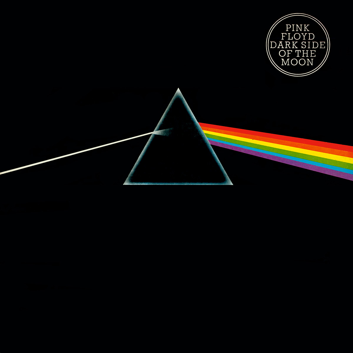
Here is a magazine advert example of flux pavilion, who is my chosen artist for my music video. It was important for me to understand how he has created and conducted is brand image through the use of magazine adverts and their album. As the audience can see the main artists face is at the centre of the magazine, this is suggests that the artists cares about his face and image. It is noticeable that his face is bright a lit up, which would suggest he is at the club scene. Which is where his music is the most likely place to be played. Itt is also where his target audience is- young people. The artist is in a triangle that draws similarities to one of the most successful album covers in the history of music. By Pink Floyds the Dark Side of the Moon.
 
 
Here is the album cover of The Dark Side of the Moon, of which one can draw on the similarities. Secondly the background of Flux Pavilion's album cover is bright strobe looking lights which links back to club music scene codes and conventions. Therefore it is important for me to include lots of strobe lighting in my music video and scenes from the club as well as nightlife. Flux Pavilion has been able to create an image of explosion and excitement through his use of colours and the effect of an explosions on his magazine adverts. This creates excitement for the audience and attracts them to listen to the music. The explosion and color effects also symbolises drug use and the effect it has on the individual.
 
 
Here is an example of Flux Pavilions album cover- Blow the Roof. One can draw many similarities to it and the artists magazine advert. Such as the effect of an explosion and the artists face on display of the album. This would suggest that the artist builds his brand around his face. This is Flux Pavilions star image which is his hair which is what audiences recognise him for. His blondes combed hairstyle is part of his star image, so is the effect of an explosion taking place as was seen in the magazine advert example. I would like to draw on something different when I do my album cover and not use font such as the one displayed. House colours are used, both throughout  the magazine advert as well as the album cover. Such as the bright colours of red, blue and pink. I will make sure to use strobe lighting of the same or similar colours in my music video to help relate back to the album cover of my song. The typeface in the magazine advert is bold and clear to attract an audience and display clearly who the artist is. However on the album cover it is messy and designed in a build in with the explosion appearing from the artist head.


Skrillex

 
Here is a magazine advert of Skrillex displayed. His face is displayed very clearly since his star image is so unique which is his shaved left side of his hair. This is what makes a big part of Skrillexs brand. His hairstyle has created a whole load of parodies.
 
Skrillexs has a range of promotional products that all link to his other aspects of his brand such as the 3 red lines representing the letter "L" is to symbolise a claw scratch. As Skrillexs wants to be seen as a monster. This fits in with his "emo-subculture". Skrillexs typreface is sharp and in capitals. This is to represent the difference in the quick changes in both the beat and the pace of skrillexs music as well as his funky style.
 
 
Here is a picture of Skrillexs album. Notice the 3 scratches that are to represent the "L"s in his name are also present in his merchandise such as his t-shirts. This helps establish and cement his brand through icons such as the 3 stripes. Additionally Skrillex uses the same typeface throught his merchandise this alsso helps cements his style and brand to audiances. For me when I am making my album I will try and play on effects on creating words as well as trying to use the same typeface throught my Digipak design. As well as using logos such as a STOP sign that will link to the lyrics of my song "I can't stop".


Rough cut

Wednesday, 25 March 2015

what is a magazine advert?

Magazine Adverts are defined as sponsoring a particular place, activity or commodity in a publication.

Functions of a Magazine advert for music

  • To promote a particular artist
  • To sell the album/song
  • To be eye catching and get the viewers attention

The conventions of a magazine advert is to

  • Where it is available to purchase
  • If it has explicit content or not
  • The release date
  • The album/song title
  • Image of album cover
  • Artists name
  • Information about the album
  • Record label logo


Here is a magazine advert for Jessie J's album who are you. It is clear that this example does follow the typical codes of a magazine advert. For example it does display the artists face, information on the album furthermore it has the album name and songs included in the album. However it doesn't show the release date of the album, this is probably as it has already been released at the time of the advert.

Sunday, 15 March 2015

Post Examples of Digipak Designs

An Indie music album-Killers Day& Age

As one can tell the font is big to easily establish the name of the album and artist to the audience. The moon and stars represent and link to the title of the album with Daylight and the stars and the moon at the same time. It is apparent to understand that "The Killers" aren't worried about there personal appearance as they don't appear on the front cover. This doesn't follow the codes and conventions of a typical Digipak. Therefore this Digipak goes against the norms. Unlike a mainstream album such as A$AP Rockys Album "Long Live A$AP".


A Pop music album example-Justin Bieber My Worlds

The Artist is easily established as he is on the front cover looing directly out, the artist as most Pop artist are viewed as a sex symbol, therefore Justin's face is displayed clearly to attract fans to buy his album. Justin Bieber is able to make the sense of a close connection with fans by directly staring straight ahead. Justin Biebers face is also only visible as he is only interested in his facial appearance and not his body.

A Rap music album example-A$AP Rocky Long Live A$AP

The Artist, A$AP Rocky isn't easily visible on the front cover as half his face is on opposing ends of his album cover, this adds mystery. This was A$AP Rocky's second album therefore he was already known so it isn't necessary to clearly display his face to the audience. Unlike Justin Biebers my worlds, which was his debut album. Secondly the genre is different between the two artist, most rap album covers don't focus on the face of the artist as well. A$AP Rocky has the USA flag wrapped around his body, which clearly displays which country that he is from.


What a Digipak is? Codes and conventions

"A type of packaging for CDs or DVDs, typically made from cardboard with an internal plastic holder for one or more discs"-(Oxford Dictionary online).


Here is an example of a Digipak, that follows the typical style of the front cover and fold style.

Front Cover

The Front cover of a Digipak usually contains an illustration or picture of the artist or something that relates to the artist. Moreover if there is any explicit language in any of the lyrics in any songs that the digipak contains then there will be a clear label, usually in the bottom left hand coroner of the front cover stating "Parental Advisory". For example Green Days "21st centaury Breakdown" is a perfect example of these codes and conventions of a Digipak with the illustration and Parental advisory label.


 Back Cover

The Back over of a Digipak nearly always contains a playlist of the songs in the album. There may be pictures or illustrations of the artist or that relates to the artist or the front cover of the Digipak. There will also be a bar code, usually found in the bottom left hand side of the Digipak cover. Again I am usuind Green Day as it is easy to follow and is relatable as my front cover example was Green Day.


First Compartment

This usually contains a booklet held by a tray that has various pictures or illustrations. Moreover it may contain Lyrics for every song in the album. The art work it may contain may have a certain style to it that relates to the genre of music.
 

Second Compartment

This contains the disk securely in this section facing upright on display.
 

Spine

On most Digipaks there is a spine that contains the Artists name as well as title of the album.


Tuesday, 20 January 2015

What record label would sign for them?


XL Recordings is a British independent record label owned by Richard Russell. It originated as a 1989 offshoot of Beggars Banquet Records and is part of the Beggars Group of labels. It is associated with some house music artists such as Tchmani. Secondly since my artist is British it would be easier to sign for a British label as it is easier to access the studio geographically. Secondly since he is only just beginning and is new it is easier to sign for a British independent record label. Who are more likely to support local artist compared to foreign record labels.