Thursday 30 April 2015

Subsequent changes to music video

I have introduced a narrative instead of random shots with no meaning, effect or purpose. The established narrative of the main protagonist trying to remember a night out however as he is confused it is not all clear therefore it is not all in chronological order adding an interactive side to the audience that they have to pice it together.  


The music video for each shot frame is coherently edited to the beat of the music. I have also put video effects to the frame aw well as creating different colors over the shots when slight changes in the music occur. As the example is town of me as skier crashing. 


I have put more props in that link the music video to other music artist of the same genre of house music. For example there are shots of the main protagonist wearing sun glasses similar to Calvin Harris and David Guetta. As you can see here i have specifically chosen some very similar sunglasses. 


Furthermore i need to put transition shots in break up the song and to act as breakaway between the main protagonist waking up and his memories for the previous night. here is a icon between

Audiance feedback for rough cut

That i need my shots to accurately be in tune to each change of the beat of the music, which fits into the codes and conventions of typical house music video. I am able to change the shots, video affect, filter change or camera movement change. I carefully look at my music volume to see if there is any spikes which i can then edit into line with the music and different shots, video affect, filter change or camera movement change. As from the screens shotted image one can see the different spikes in volume.
Secondly shot order was an important to consider that I was told as my music video should make some sense with some chronological order so it does follow some chronological order, however as I have said before the main protagonist can't fully remember what has happened skiing is to represent I can't stop 

Analysis of rough cut using Goodwins theory

Firstly I would say overall my rough cut does demonstrate house genre style characteristics. such as a urban setting as most house music videos are set in urban areas. Secondly I have girls that are rather good looking in my music that into the conventions. Additionally I have a vast range of strobe lights going off in numerous shots, which relates back to my target audience

I have a range of shots from close ups, mid shots, longs shots, panning shots and etc.. Usually record label request that a rang of shots are made as well as close ups on certain protagonist which I have done. 

There are interextual refrences that relate to the lyrics such as "I can't stop" relates to drug affects, such as ecstasy or MDMA. taking its affects. Therefore I have shots of people looking like they're off there faces. I have used skiing to represent the drug affect as well as being out of control however in my final cut I will make sure to edit the shots more accurately to make it more obvious to the audience that I am doing that and creating that affect and meaning.

The relationship between lyrics and visuals are key in this video as there is only one line of lyrics that repeats itself constant. Therefore I have put shots in such as car reving up on its dial. Lots of fast paced shots, skiing and relating it to being out of control and not being able to stop.

The relationship between music and visuals is key since it is a house music video so the shots needed to be edited to the beat of the music. In my rough cut I have done this however I could edit more precisely to smaller changes in the beat of the music by use of shot change, video treatment affects, etc..

Explanation of pre-production of music videos

Here is a short video with an explanation of pre-production of music videos.


This video contains a set by set guide of the process of the pre-production of music video and whats the best check list to have.


Sample fonts that reflect and represent the house music genre

EF FUTURA EXTRA BOLD

Is a possible option that I could use as it is clear bold and loud that captures the attention of the audience quickly. The font is flat and sharp symbolising the intentisity of the beat and the change thrrought the song.


Many house music uses strange out the world pop art style fonts for their digipak. In the case if the chemical brothers one, It gives the cover art 1960's-style and feel. The cover was designed by Tappin Gofton. The typeface used in their logo is derived from Sho typeface designed by Karlgeorg Hoefer.


I want to create something inbetween the different fonts used in both albums that linkin park and the chemical brothers have used on there album covers.

Digipak planning

My plan for my Digipak is to create something urban however colourful as well. As the genre of my music video is house music which is usually associated with urban areas. This is because house music is mainly played in clubs, most clubs are based in urban areas. Secondly the reason that I would like my digipak to be full of colour as well is that house music is very diverse and one way to show diversity is through the use of a large spectrum of different colours. Secondly the beat of my music changes through my song therefore the beat of my song is unpredictable from going to sharp beat to a more flat beat. therefore I would like to symbolise this through my Digipak as my song is something unique. I want to illustrate this on my digipak by having small shapes on my digipak that are different shapes. Some that are of a sharp shapes such as triangles to symbolise a sharp beat that my song initials. Flats shapes such as squares and rectangles to represent the flat beat my song entails as well.

Editing process with with a detailed account of what i did with my footage and why i did it

Here is a image of iMovie which i used as a tool to edit my footage. 
Here is a picture of all the possible editing techniques. I am using as many tech niches as possible for editing as i realize this will make my music video interesting. As it would help attract the audience which changing pictures. I also to fit in with the codes and conventions of a house music video, with quick and variety of editing shots. 
Here is a picture of the watch is supposed to act as symbolism as it is supposed to relate to time not being able to stop 
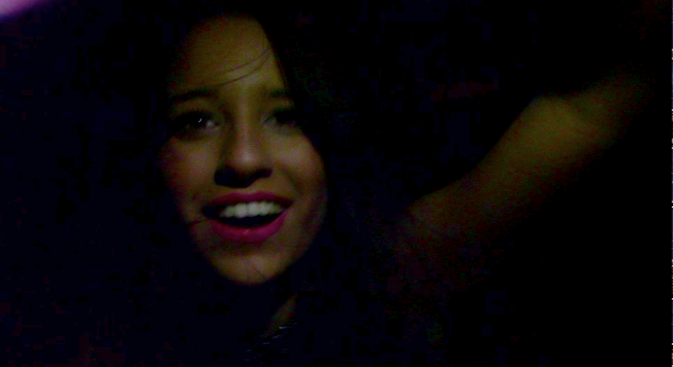
Here is a picture of one of the main protagonists but acts as a mysterious girl as the main protagonist tries to recall the previous night but not in chronological order. I also used edditing to display strobe lighting going off in the back ground using the cutaway effect which merges to shots together. Creating a shot that looks like a club fitting in with the codes and conventions of house music videos.  

Here is a picture of downloaded music save to iTunes that i could implement into footage.
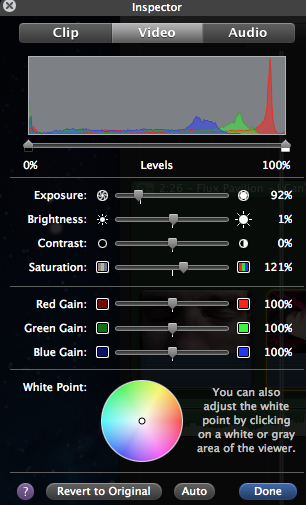
Here is a picture of the different treatment I am applying to each shot which for example will change the contrast and brightness. 


Here is a screenshot of the transition icon on iMovie to represent the switch from modern day to the main protagonist trying to remember what happened on the previous evening/night.

Here is a screenshot of the different video effects that i can use on shots. I decided to change video effects when there was a minor change in the beat of my song.


Here is a screenshot of the editing process on iMovie with different shots of segments of my music video, as one can see the shot changes are timed perfectly with each change in the beat of the music as you can view the spike changes perfectly linked up with the shot frames. 

Here is a screenshot of ken burns was useful as it mean i am bale to crop certain shots and add movement to static shots as well making more music video more interesting for the viewer.


Wednesday 8 April 2015

Different fonts

I had a look at a rang of possible fonts that I could use for my digipak and my magazine advert. However I chose to use a "CARTOON" FONT on my digipak, I chose this font as it stood out, which was important on a background that was very colourful, secondly it does follow the codes and conventions of house music as it is bold and clear. However for my magazine advert I decided to put Italic effect on "CAARTOON" FONT. As I wanted it slightly different to my digipak, so that it could be distinguishable between the two. 


Saturday 4 April 2015

Final Cut- With Explanation

Here is my final cut for my music video, I closely followed Goodwins theory of music videos, Dyer star theory and the codes and conventions of house music however I did make sure that I slight deviated fro the codes and conventions of house music. For Goodwis theory I made sure apart from other things that there was a strong relationship between the lyrics and the visuals. For example "I can't stop" I made sure to link it with shots from a first persons shot of going down hill skiing to represent a sense of out of control as well as not being able to stop. For Dyer star theory I made sure that the main protagonist in my music videos were wearing clothes that linked to the hegemony of the house genre. Therefore this should theoretically boost album sales, as the audience and fans can relate to my artist. I made sure that it follows the codes and conventions of house music since the shots and effects are edited to the beat of the music. I have gone gaist the codes and conventions of house music, by showing some of the artists face, however artist such as David Guetta does this as he has made a cross over from house artist to almost pop artist.

Treatment- Give detailed treatment for your video- explain ideas link to target

What I am trying to create is something that does follow Goodwin's codes and conventions of music videos, however my music video will also still link to the target audience. Who would be 18-24 year olds as the primary audience. I want to create a music video that is edited to the beat of the music, with fast and exciting changes in shots with many effects included with them. I also want to create a strong relationship between lyrics and visuals, e.g "I can't stop" with displaying something that is out of control I have considered shots of skiing using a go pro camera, which displays a change in camera type, as well as camera angle.  I also will follow the codes and conventions of typical house music scenes such as clubs. Usually record labels may want close up on the artist face I will supply these shots to a certain extent with my music video however, I still have to tie in with the codes and conventions of house music shots on there artist. They tend not to show the face of there artist as house artists claim to care more about the music instead of the fame. However I do realise that some of the artist face needs to be shown to create a strong brand identity. Therefore I have found a compromise of wanting to show some of the artists face but not revealing all of it. Therefore my artist flux pavilion should still be okay.

Wednesday 1 April 2015

Two Artist of the SAME GENRE AND STYLE as my chosen artist

Since my song genre is house I therefore reaserched through the use ofggole images different house songs. One I looked in to was Deadmau5 which is actually an artist that I have heard of but I hadn't really looked into them therefore since I like a challenge I decided to look into them. I particularly liked there front cover for the album named 4x4=12.  


This is because the front cover is  simple but effective. The mouse logo has been used which is there logo which Deadmau5 are recognised for,  In addition they have made the outline of the mouse in a neon green colour to give it the effect that its been lit up, this luminescent colour links with the house music genre as it recreates the colours used on club lighting The image of the mouse is placed in the centre of the album making it the main focus of the cover.  I hope to create this effect by having the main focus of my album cover at the centre of my album cover. The artist names and album name is located at the top of the cover so your eye is drawn straight to it naturally, moreover these names have been placed in the same neon green this means continuity is kept. which helps create a strong brand.


 Here is a magazine representing Deadmau5 note that there is brand being created as the artist does't show his, secondly the use of having the mouse head pice on, which is what deadmau5 icon and what they are recognized worldwide for. This is what deadmau5 is recognized for therefore for the sake of continuity it is important that for most of deadmau5. That is why both on his album cover and the magazine the mouse icon is displayed. 


Here is the front cover od David Guetta One love album, I have already researched David Guetta in my research and planning of codes and conventions of different house artists. This digipak represents David Guetta well as a dance artist because on the front cover it shows a mid shot of him wearing a white t-shirt and sunglasses. This picture links in with dance conventions well as he is wearing big sunglasses which connote fame and high status, also a lot of dance artist wear sunglasses indoors in their music videos such as Calvin Harris. His t-shirt which is casual clothing which links in with dance genre of being casual, this links to what costumes I want to include in my music video, of casual clothing for any guys. It is effective that he is black and white as it makes him stand out, it is similar to deadmau5 in the sense that the artist doesn't want his face fully exposed therefore he has sunglasses on to cover some of his face. The reason that he doesn't want all his face shown is that he cares more about the music instead of the fame. I may use this in my album cover by still including sunglasses as well. Secondly I have taken note as Guetta is in Black and white I may want to incorporate this in my magazine advert and/or digipak as I want to make sure that my artist does stand out as he is a new artist but I still want to follow the codes and conventions of house music. David Guetta creates a strong brand image through his sunglasses as he is associated with them, therefore recognisable. Furthermore he has another distinct feature, his long hair which also symbolises the house music genre of being relaxed.


Here is a magazine with a picture of David Guetta, as you can see he has his sunglasses on, still the same that he has on his album cover. There'r he is strengthening his brand image through the use of continuity. He also has casual lose clothing on, which is the typical dress wear for house music fans, this relates to dyer star theory as the artist links to his fans through the use of hegemony as he has a similar culture. Therefore the mix of a strong brand and the use of shared hegemony between fans and the artist it should only boost record sales. As they find more things in common and can relate to the artist.